Vanguard Advisors
Vanguard needed to redesign their website in order to meet their financial advisors’ needs by giving them quick access to the relevant products and information they were looking for. My team at Huge collaborated with our designers, producers, and strategists to deliver a WCAG 2.1 AA compliant front-end component library using Vue. Vanguard’s in-house team then integrated the site with their existing back-end. I set up our development environment using Vue CLI, Prettier, ESLint, stylelint, PostCSS (Autoprefixer), Sass, and pre-commit hooks.

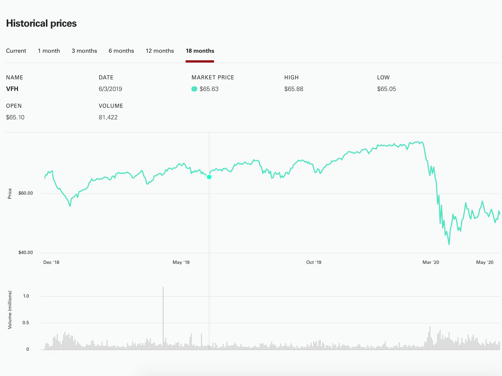
With the need to display vast amounts of data in easily digestible formats across different devices sizes, this project presented a number of challenges. I evaluated different chart libraries with two criteria. First, it should be easy for our client to implement, and second, it should be customizable enough to accurately reflect our designs. I settled on Chart.js. Our most complicated design consisted of a line chart stacked on a bar chart, requiring the tooltip to remain in sync between them. I was able to write a plugin for Chart.js to draw a vertical line over the active point and simulate mouse hover at the x-coordinate of the opposite graph to make it look like one graph rather than two.

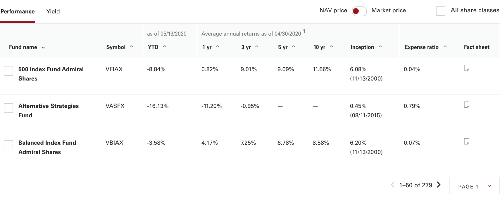
Another complex component was a responsive table that needed to have sortable columns and pagination. Vue’s computed properties proved themselves invaluable for this. For the pagination, I created a component that renders the pagination, receives the list of rows from the table, uses computed properties to calculate which rows to display based on page selection, and sends that result to the parent. The sortable column headers use a reusable component that sends the new sort criteria to the table, which then uses computed properties to automatically sort the rows.


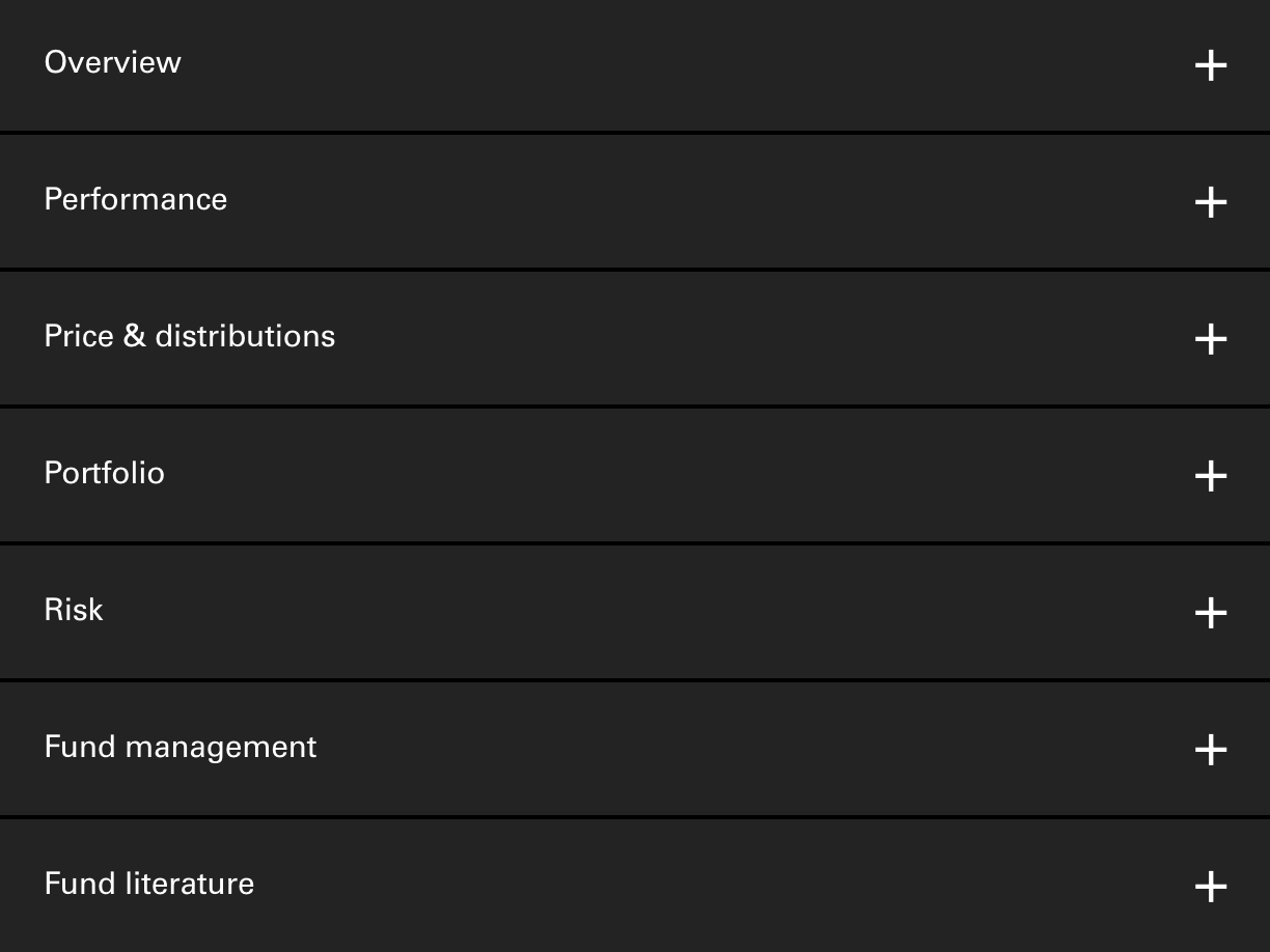
Lastly, the product detail page had a requirement for an in-page navigation system. At desktop sizes, it needed to be a typical sticky navigation bar that scrolls the page on click, and at mobile sizes, it needed to be an accordion. This presented an architectural challenge. For desktop sizes, a navigation section needed to be aware of where the corresponding’s content exists down the page, and for mobile sizes, each section’s content needed to be packaged with its corresponding header. I created a navigation component that accepts an array of objects providing the title, slug, and component to display. Using this array, the template loops through each object and creates a navigation section in the bar. Then it loops through the same object again, creating a content container for each section using the provided components and slugs. The accordion header exists in this section, displayed only at the small breakpoint, while the bar is displayed only at medium and large. This component drastically simplified the process of adding content sections to a complex navigation system.