Long & Foster Redesign
Long & Foster, the nation’s largest privately owned real estate company, was in need of a major redesign for their site. This was a year-long project, which I saw through from strategy and branding to launch. Because we were working as a small team, I had opportunities to do a lot outside of my typical job description, such as a content audit, but my primary role in this project was in building out prototypes.

RP3 Agency was hired to design the website, while RED, a company that specializes in a real estate based CMS, was hired for the production. My job was to work closely with our team to develop responsive HTML prototypes to clearly represent our intentions for the site at any browser size.


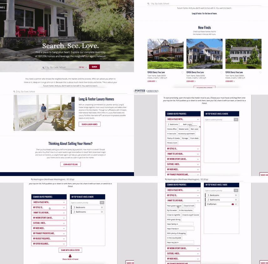
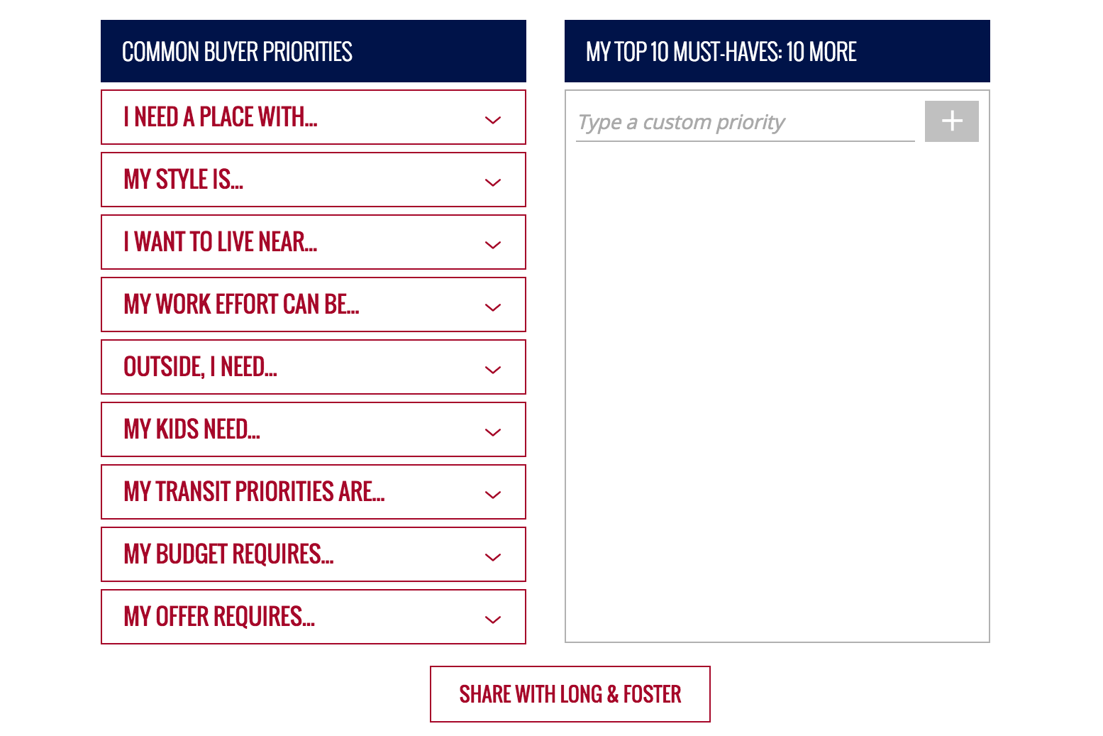
One part of the site that involved a lot of UX thinking and iterative prototyping was a priority sorting tool (demonstrated above) that buyers and sellers can use to figure out what their needs are and share them with a Long & Foster agent. This helps generate higher quality leads for the client because the agents gain a better sense of the customer’s needs than a traditional lead form. The finished site saw a 4x increase in leads, with hundreds of thousands of users and more than 10,000 agents.
