HRCI UX Overhaul
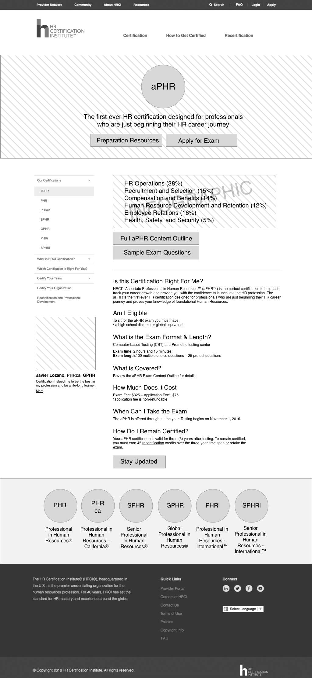
The Human Resources Certification Institute (HRCI) had recently expanded and simplified their certification offerings. They needed a refresh of their website to make both finding the right certification and signing up for it simple. RP3 Agency was asked to create five new templates for their CMS. As the lead UX designer on the project, I identified aspects of the site that were in the most need of UX updates. I designed wireframes using Sketch and presented them to the client with InVision.
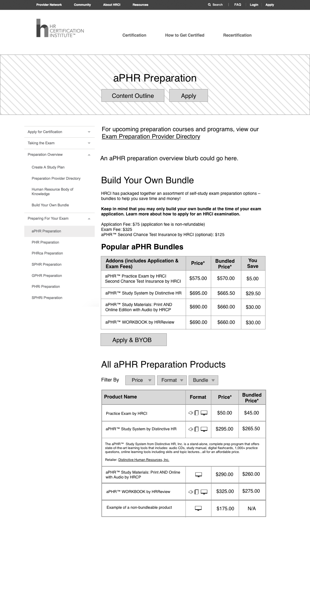
Two of the biggest overhauls were the Build Your Own Bundle (BYOB) page and the Preparation Products page. The BYOB page allowed the user to put together an assortment of preparation materials along with their exam application at a discounted rate, while the Preparation Products page listed preparation materials for all exams. The original BYOB page listed bundle options for every exam, and did not include information about the preparation materials aside from titles, with the result that a user had to refer to the Preparations Materials page for detailed information about a particular item. Because each exam is for a different type of HR professional, it was not important for a user to be presented with preparation materials for all exams. I proposed creating exam-specific preparation pages that include both bundle options and preparation materials, with accordions to provide more information on materials right when the user needs it. This resulted in a drastically simplified experience for the user.
I became the lead front-end developer, using tools such as Sass, EJS, and bootstrap.


